The homepage is intuitive, resource-oriented, and easy for veteran users to navigate at a glance
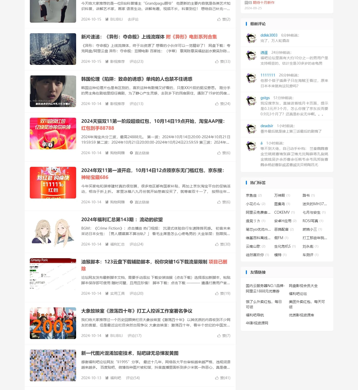
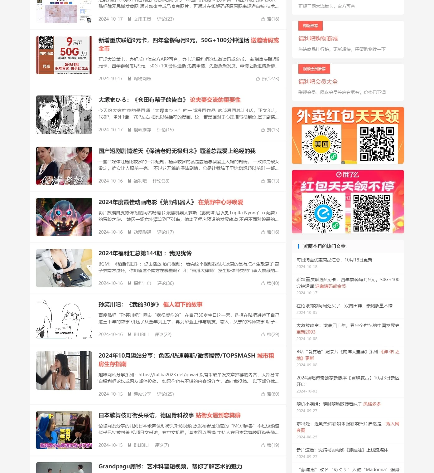
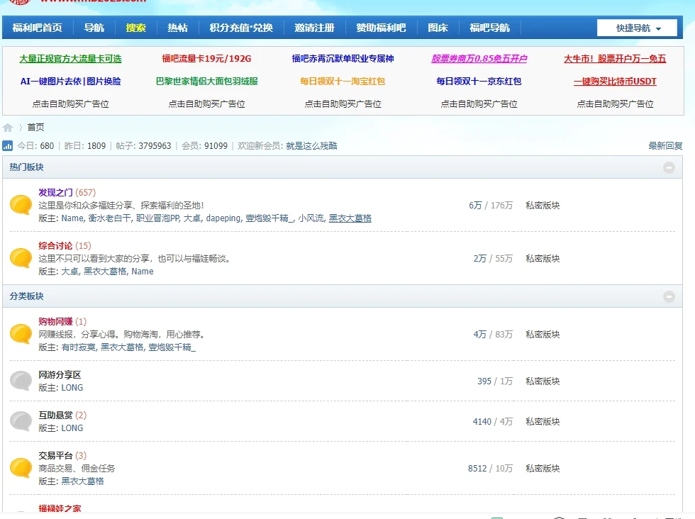
When I first entered Welfare Bar Forum, honestly, it felt a bit like 'going back to the old forum era.' The entire page uses a blue and white color scheme, with a structure reminiscent of my early days on Tieba—clean, straightforward, without much visual distraction. The homepage features some recent popular discussions and newly posted content. A quick scan reveals many resource keywords like image collections, community links, and some app compilation collections. Although these names are quite 'discreet,' experienced users understand them immediately, mostly referring to private content categories.
Traditional forum structure, simple and straightforward functions, clear and easy-to-find categories
The forum’s underlying framework is actually a classic BBS system (I later found out it’s Discuz), so the overall operation logic follows traditional processes like posting, replying, private messaging, and pinning. The good part is the clear categorization and fast loading. Sections like 'Image Collections,' 'Video Collections,' and 'App Sharing' can be quickly accessed, and the number of posts is quite large with impressive activity. For example, entering a 'Resource Summary Area' casually, the post count starts at over a hundred thousand.
Resource types are varied but centralized, labels are easy to understand
The section names are quite 'low-key,' but inside you basically find all kinds of practical resources. Whether you want high-definition images, specific community group entrances, or some useful small tools, they are basically all here. Some sections also have tag filters like 'Collections,' 'Daily Updates,' and 'Original Releases.' They look simple but are quite practical. From my browsing, the resources are diverse but not chaotic, with a classification logic leaning towards experienced users, skillfully guiding you to the category you’re interested in.
Basically no registration needed to view, but deeper access requires 'points'
One point I’m quite satisfied with is that much content can be viewed directly without registration—titles, summaries, and some of the main text are visible. To post, reply, or download, registration is required, and many premium resources need to be unlocked with 'points' or 'coins.' After registering, I learned these points can be slowly accumulated by replying, signing in, sharing, or can be purchased. Honestly, although it’s an old routine, it’s quite immersive to play.
Interaction methods are a bit old-fashioned, but all necessary features are present
The forum’s functions are quite basic, lacking likes or dynamic comments typical of new communities. It mainly relies on the rhythm of 'posting and replying' to maintain discussions. However, it supports private messaging, reporting, posting external links, and bookmarking posts. My experience feels more like a 'settled' resource community—not as lively as social platforms, but most posted content doesn’t disappear and can be continuously rediscovered and reused.
Mobile experience is not very friendly, recommended to use a computer
I tried opening this forum on my phone, and honestly, the experience was not good. The font is too small, the layout is not responsive, buttons are easy to misclick, and complex operations like posting are difficult. On a computer, the whole page runs much smoother, loads quickly, and is straightforward—perfect for browsing posts and saving resources slowly in a quiet environment.
The content volume is really large, and update frequency is high
The forum’s overall activity is quite high. I saw that in the 'Popular Collections Area,' new posts appear almost daily, with many posts having over 100 updates, continuously adding content. I also saw some 'collection-type' posts that keep updating resources and organizing packages, similar to a 'site-wide resource main entrance,' very suitable for bookmarking and digging through slowly.
Search and content quality are uneven, users need to filter and judge themselves
Of course, the forum is not perfect, especially for newcomers who might find it hard to locate things. Much content is buried deep, and the search function is not very smart. Searching keywords returns many posts that you have to click through and browse yourself. Some posts are empty or advertisements, which can feel like a waste of time. Additionally, some resources require clicking external links, some of which have poor user experience or occasionally fail to open.
Suitable for goal-oriented resource explorers willing to put in effort
Overall, Welfare Bar Forum is more suitable for users who clearly know what they are looking for and are willing to browse posts slowly. If you are here for certain collections, specific small tools, or community entry points, there are indeed quite a few "hidden benefits." However, if you seek a mobile experience, instant interaction, or visual enjoyment, you might find it too "retro."



 Chinese Adult Websites
 Real Young Girl Virginity Loss

 Free Instant Play
 Online Instant Play
 Yo Girl Incest
 Banned Film Paradise
 Adult Video APP (Application Center)
 Watch Porn for Free
 91 Pink Hole
 X Station Collection
 91 DouYin
 Yellow Fruit Short Drama
 AI Lust Beast Cave Academy
 91 Video
 Sports Chess and Cards
 New Lisboa
 Macau New Lisboa
 Venetian
 Macau New Lisboa
 Kaiyuan Chess and Cards
 Mahjong Win
 PG Entertainment
 Macau Casino
 Macau Grand Casino
 Macau Sands
 Gossip and Scandal Adult Websites
 Gossip Net
 Asian Porn Websites
 korean porn movie
 missav
 Free KISSAV
 Netflav